A complete visual identity and brand manual for a newly forming student tech community running hackathons, workshops, and educational content.

In early November 2025, students came to me with a vision to found a new technology community called Labz. Their goal was to create a living platform connecting students, mentors, and companies. The association wanted to focus on organizing hackathons, technology workshops, and creating educational content on social media.
For the project to feel trustworthy to corporate partners and attractive to the students themselves, it needed a professional, modern, and easily recognizable visual identity — literally from scratch.
No visual anchoring: The emerging community had no face and no rules for presenting itself.
The contrast challenge: We needed to create a brand that would connect seemingly different worlds — the austere logic of programming with human informality and student creativity. The identity had to be energetic enough for young people, yet clean and trustworthy enough for sponsors and mentors.
Flexibility for digital-first use: The system had to be maximally versatile on social media (Instagram, LinkedIn) and at physical events.
I worked entirely on my own on this project. I stepped into the role of lead brand designer and covered the whole process from initial consultations to final delivery:
Client communication, needs analysis, and defining the visual strategy.
Ideation and sketching of logo, typography, and symbol concepts.
Creating the graphic system (palette, typography, patterns).
Designing social-media templates and preparing assets.
Compiling a complete brand manual as a guide for future use.
In creating the identity I leaned on the concepts of development, code, and connecting:
Type and typography: I chose the clean geometric typeface Century Gothic Pro in lowercase, which feels approachable and informal. As a contrast, I added the pixel typeface Joystix, inspired by 8-bit aesthetics and the developer world.
Code symbol: From the programmer's brackets icon </> I created the central brand symbol and a standalone element.
Pixel pattern: By developing the structure of the symbol, a modular pixel pattern emerged (a grid of squares) symbolizing the community's growth and the connecting of ideas.
Colors: The main color became the electrically vivid Labz Blue (#1A19FF), complemented by Core Black and a light Light Base to maintain high contrast.
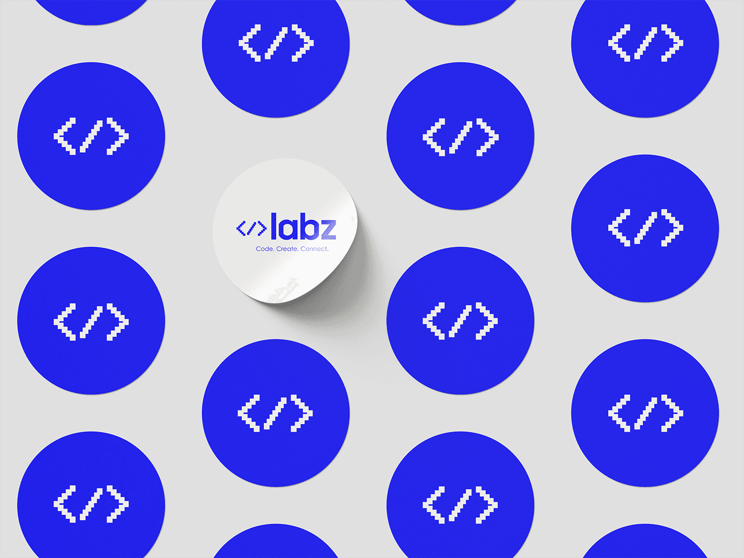
The result is a cohesive visual system documented in a detailed brand manual:
Logotype and symbol: The typographic labz logo complemented by variants of the </> symbol designed on a pixel grid.
A flexible visual element: An accent pixel pattern for corners and backgrounds that works as a unifying motif across graphics.
Design for social media: A set of ready-made templates (posts, carousels, Reels covers) that let the community easily create attractive content.
Usage rules: A clearly defined clear space, color palettes (CMYK, RGB, HEX, Pantone), and prohibited manipulations of the logo.
Handing over a working tool: The association received a complete visual ecosystem including templates, thanks to which even non-designers on the team can immediately produce professional outputs.
Ready for launch: The brand gained a strong, memorable face that immediately sets it apart from traditional academic associations and gives it a modern tech feel.
Professional presentation: Thanks to the manual, the association finds it easier to deal with sponsors and partners for upcoming hackathons and events.
What the project taught me: Working on Labz was a great exercise in projecting abstract themes (code, community, development) into a very concrete visual language that doesn't feel like a cliché. I enjoyed finding the balance between a "geeky" pixel aesthetic and clean modern branding, and it showed me the power of modularity — how to build a whole dynamic identity from a single simple </> symbol.

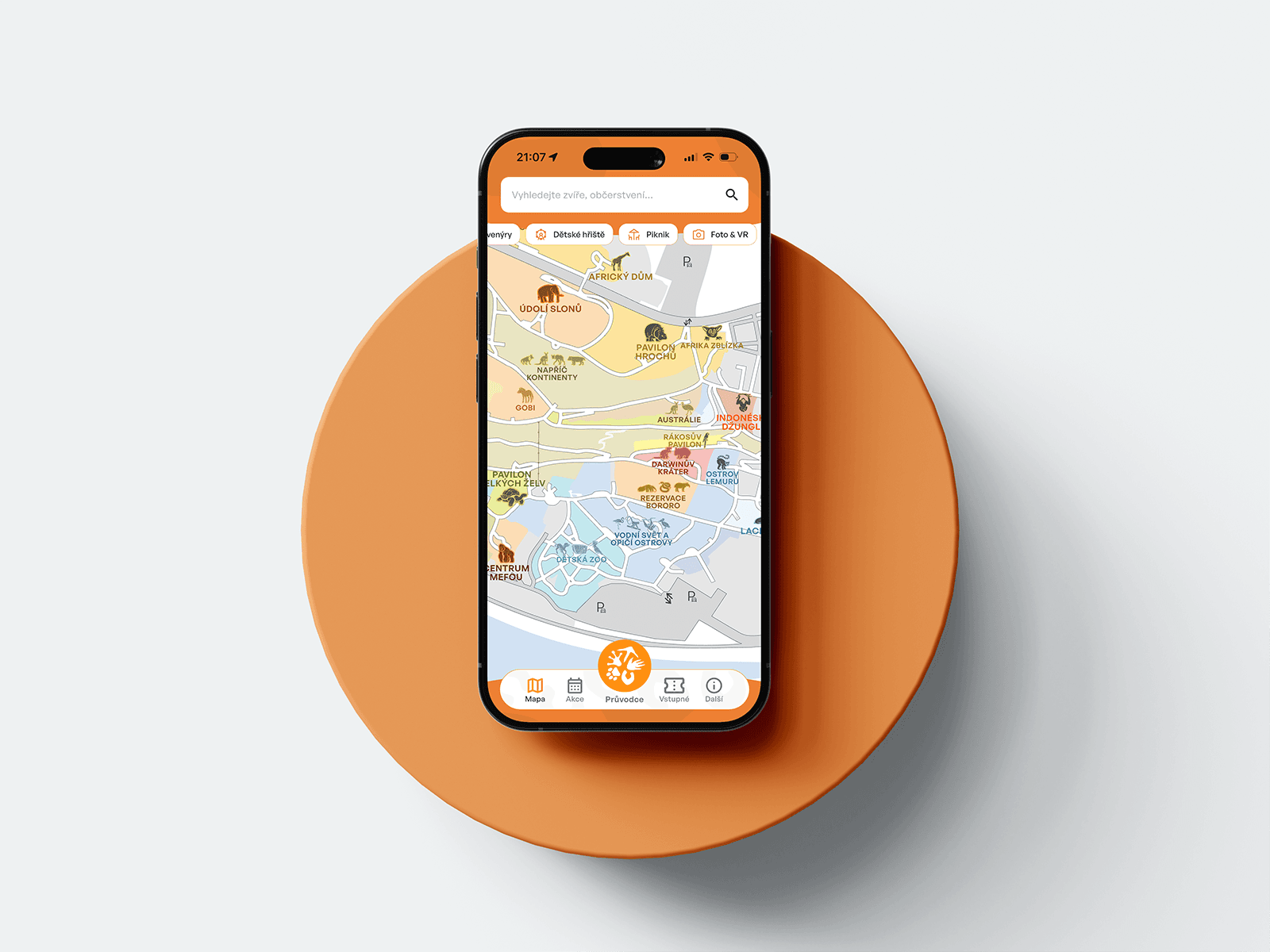
A mobile guide to Prague Zoo — interactive map, ticket sales, animated onboarding.

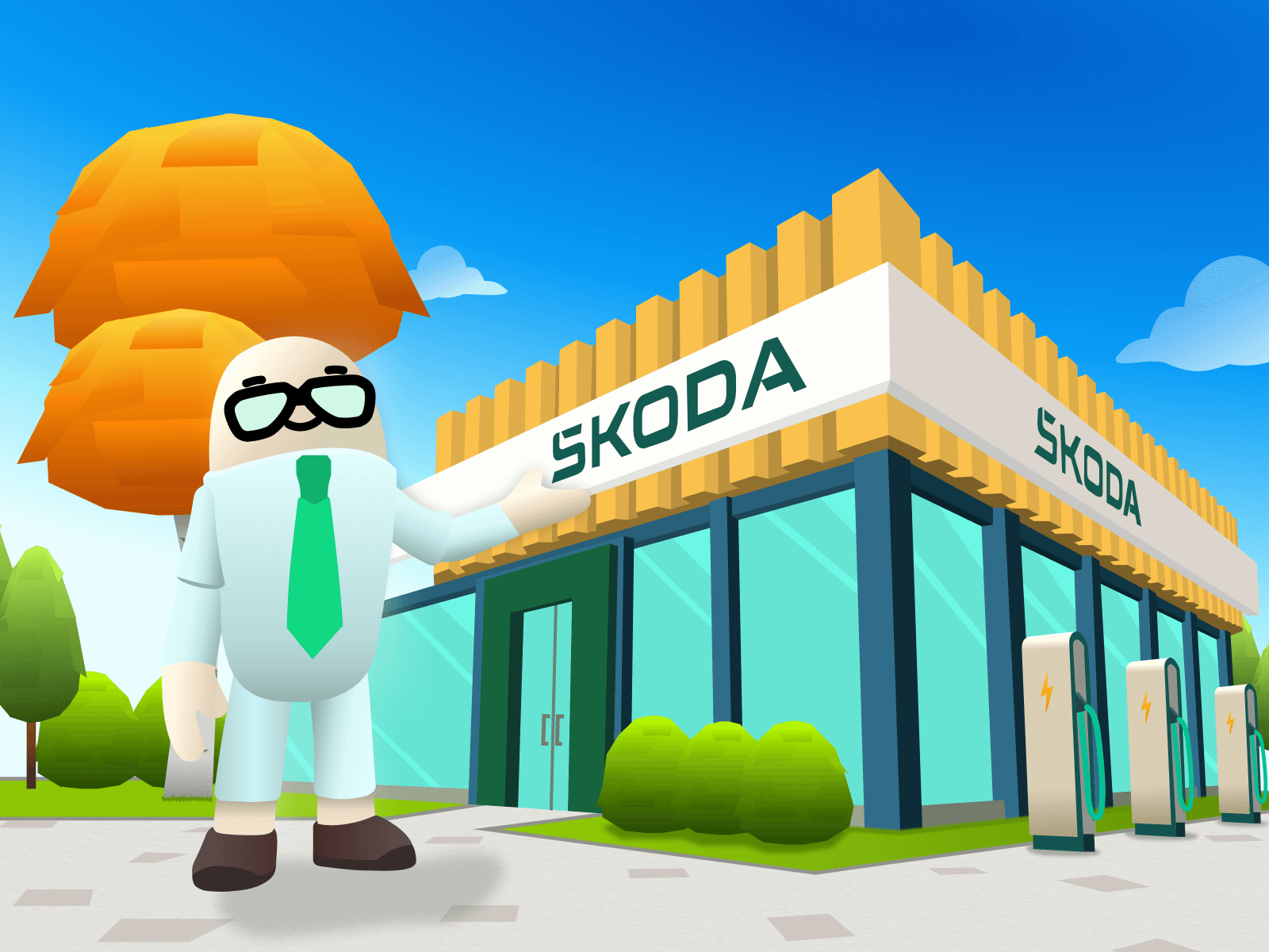
Gamifying Škoda Auto's corporate strategy as a 3D open-world game.

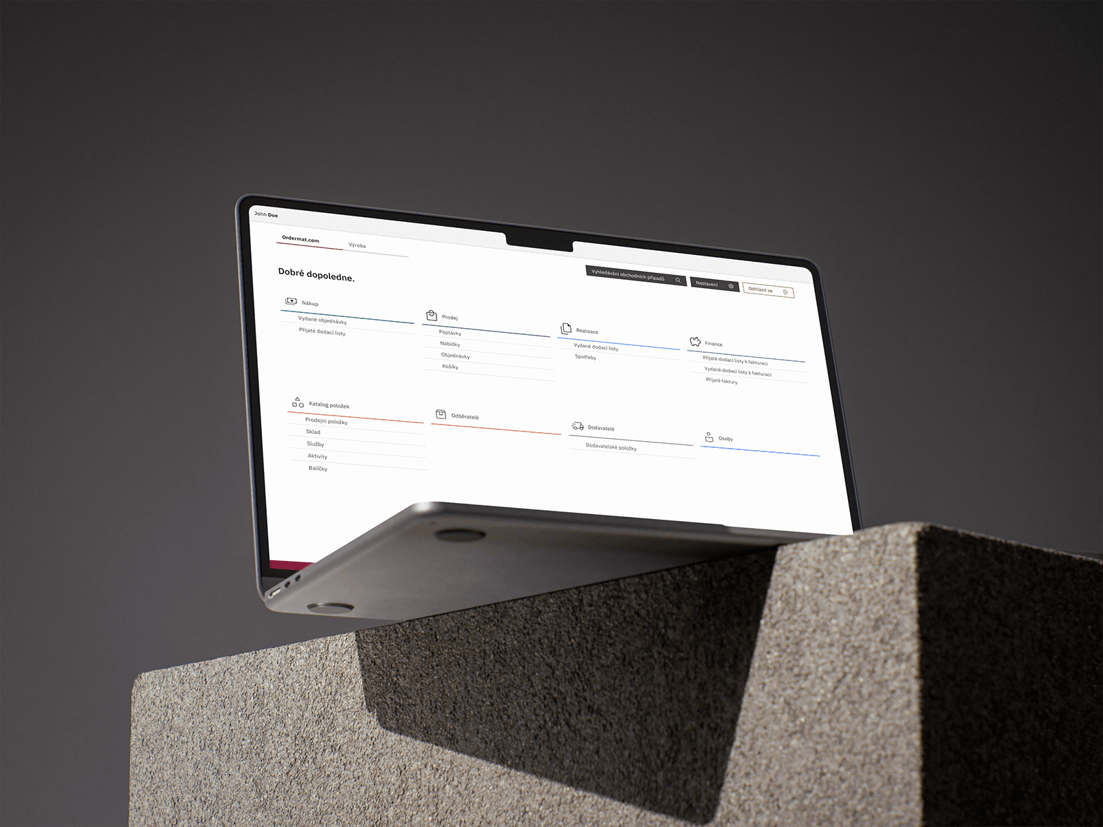
A robust company-management system with a connected B2B/B2C e-shop for catering.

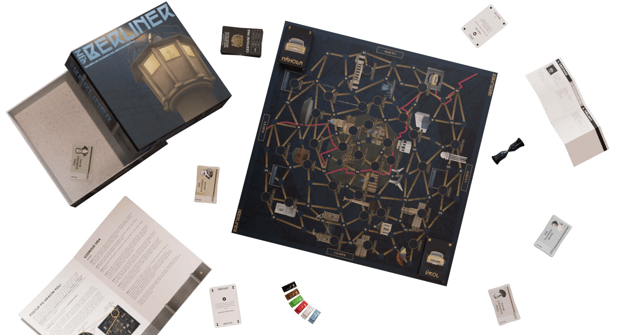
An original board game inspired by Papers, Please!, set in divided Berlin.

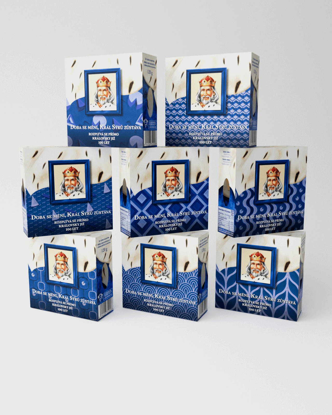
An anniversary packaging edition for an iconic cheese brand that won the competition and reached shelves across Czechia.

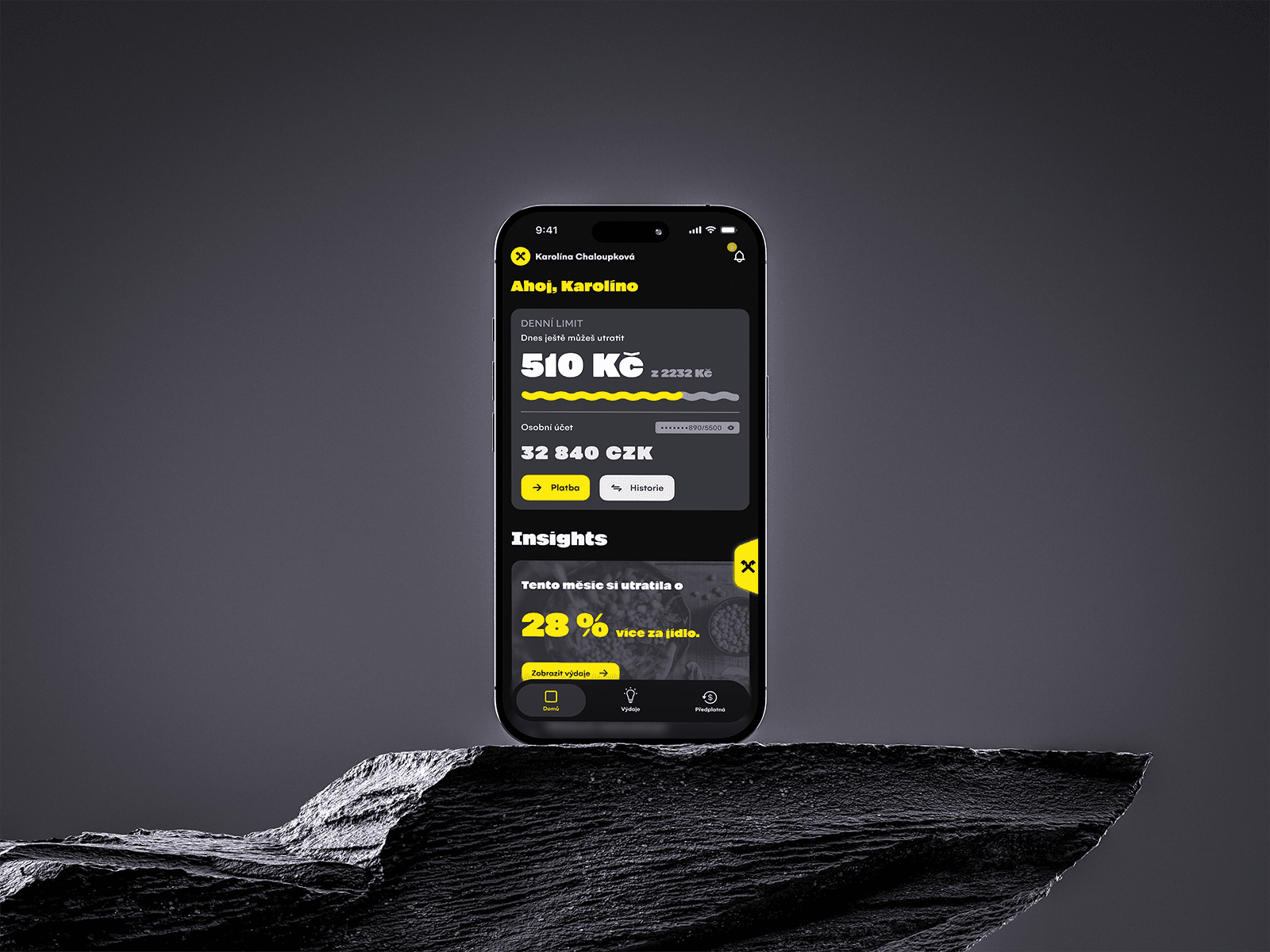
A concept mobile financial coach built on conversational AI, turning passive banking into proactive money management.

A complete visual identity and brand manual for a student tech community running hackathons and workshops.

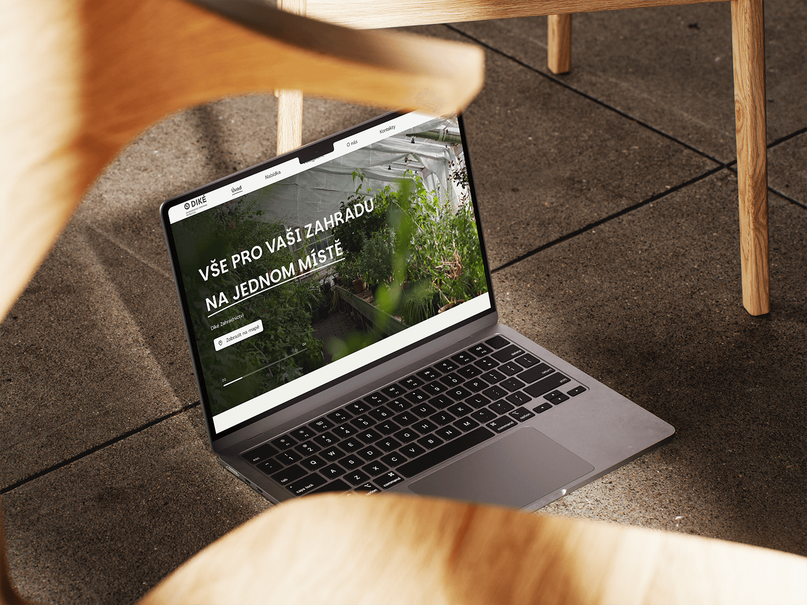
A website redesign for a traditional garden centre — clear presentation of products, services, and live info, fully responsive.

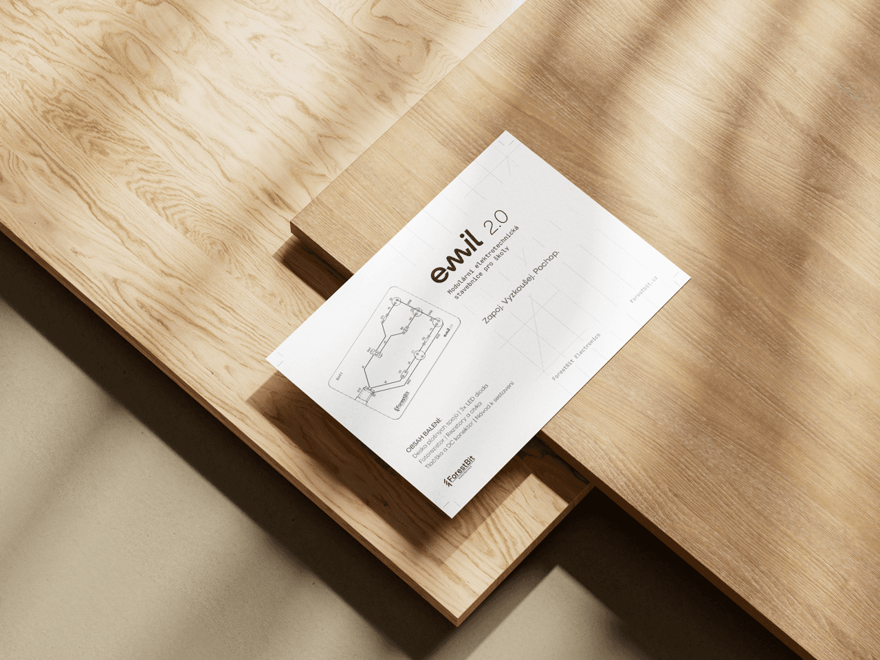
Turning a technical prototype into a market-ready product — a cohesive visual identity built to scale to web.