An anniversary packaging edition for an iconic cheese brand that won a commercial competition and reached real retail across Czechia.

The Graphic and Media Design studio at VŠKK has a long-standing collaboration with the renowned studio YellowShapes, which specializes in packaging design. The studio brought a real brief directly from a client — to create a limited anniversary packaging edition for the Král Sýrů brand, with the promise that the winning concept would go into production.
For me personally it's a matter of the heart. I had come from a technical secondary school and had been studying graphic design for only half a year. Even so, our design appealed most to the Král Sýrů representatives and became my very first realized commission, which then stayed on store shelves for a whole year.
User/market problem: Limited editions of traditional brands often slip into blandness, or on the contrary lose their original identity entirely, which means customers no longer recognize them on the shelf.
The business brief: Král Sýrů defined a clear slogan: "Times change, Král Sýrů remains." The task was to design a series of packages that would visually support this claim — showing a product whose surroundings adapt to the changes of time, while its traditional core remains untouched.
I worked on the project as an equal duo with a classmate. Together we came up with the central creative concept and visual metaphor and developed the graphic designs and typography in Adobe Illustrator and Photoshop.
On top of that, I took the initiative on the presentation and created an interactive 3D model of the packaging for the final client pitch.
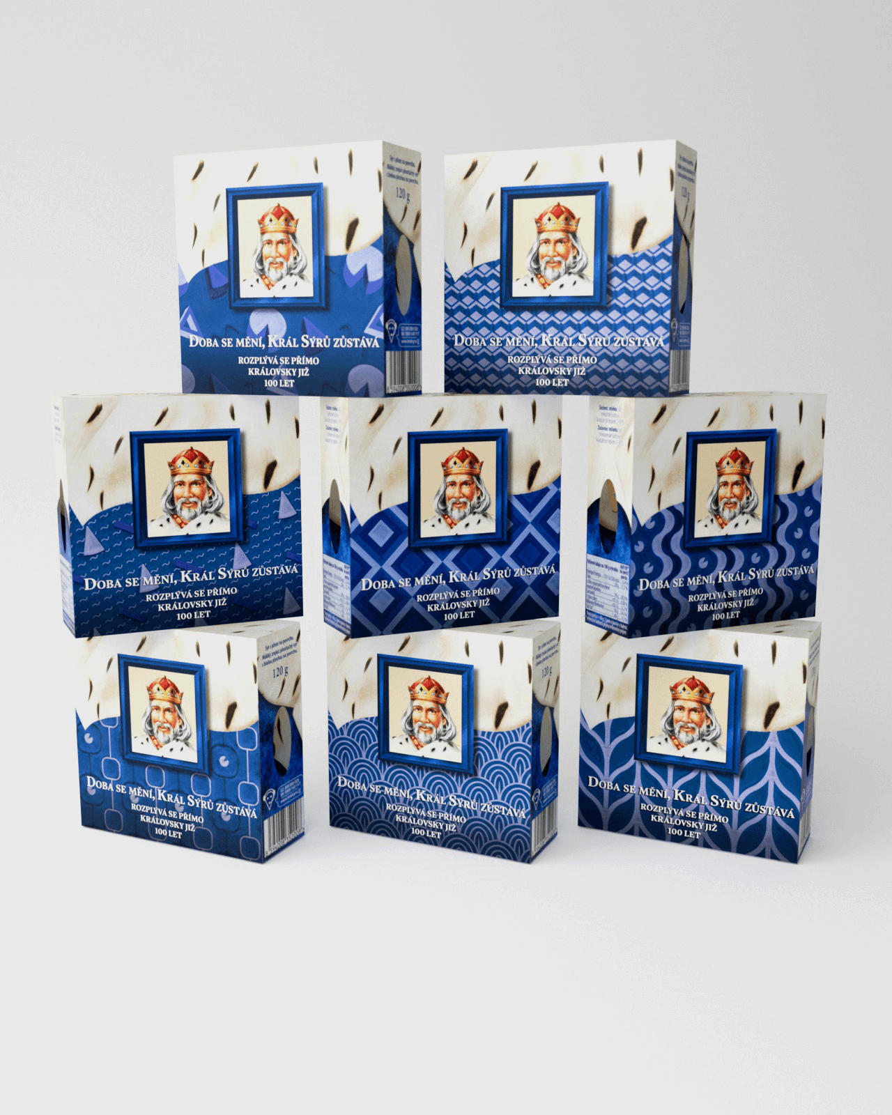
We grasped the idea of "the passage of time" through the motif of home and wallpaper. We placed Král Sýrů in an iconic frame as a constant value, while the environment around it changed:
We designed a series of original patterns representing different decades, styled as period wallpapers.
We created a visual system that works as a cohesive line on the shelf, while each individual package tells its own story of history and the present intertwining.
The result is a series of packages where Král Sýrů stays in its iconic frame as a constant value, while the surrounding environment — styled as period wallpapers across the decades — changes. The line works as a cohesive whole on the shelf, and at the same time each package tells its own story of history and the present intertwining.
The project was a mature example of how a great idea and an excellent presentation can decide a commercial competition.
Innovation in presentation: For the final pitch to YellowShapes we were only supposed to bring paper mock-ups. I decided to go a step further — I fully modeled the packaging in 3D and textured it. The studio representatives were handed an iPad at the presentation where they could view the product and rotate it from any angle in real time.
Business and market impact: Our concept won the competition. The limited edition went into mass distribution and could be seen on store shelves across the Czech Republic from September 2023 to September 2024.
What I learned: It was my first successful commercial project. For the first time I experienced the feeling of thousands of real people seeing, buying, and holding a design that had started on a computer monitor. I realized that even as a student at the start of the journey I can compete with a great idea and by doing "something extra" — in this case an interactive 3D presentation that helped sell the idea.
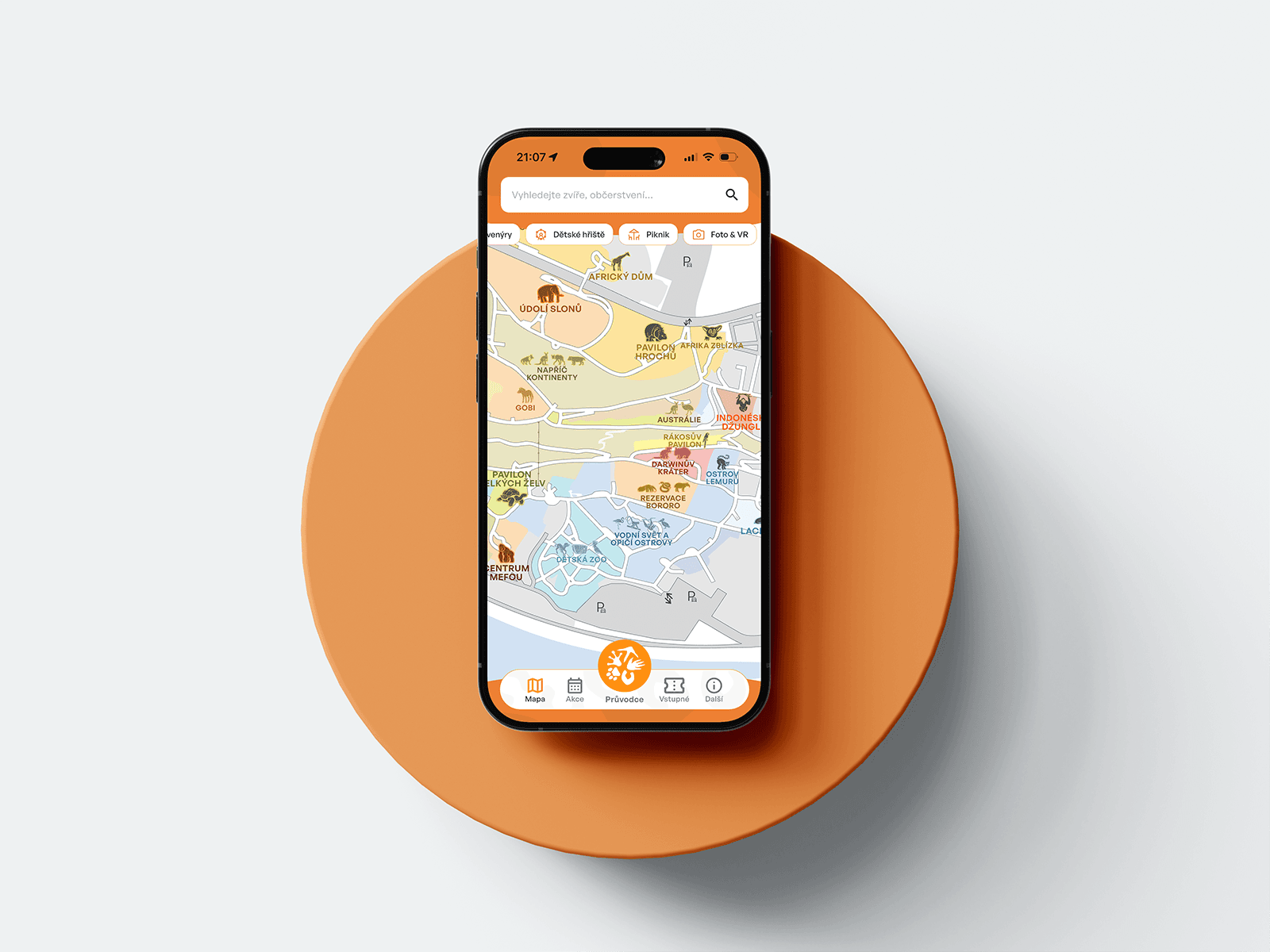
A mobile guide to Prague Zoo — interactive map, ticket sales, animated onboarding.

Gamifying Škoda Auto's corporate strategy as a 3D open-world game.

A robust company-management system with a connected B2B/B2C e-shop for catering.

An original board game inspired by Papers, Please!, set in divided Berlin.

An anniversary packaging edition for an iconic cheese brand that won the competition and reached shelves across Czechia.

A concept mobile financial coach built on conversational AI, turning passive banking into proactive money management.

A complete visual identity and brand manual for a student tech community running hackathons and workshops.

A website redesign for a traditional garden centre — clear presentation of products, services, and live info, fully responsive.

Turning a technical prototype into a market-ready product — a cohesive visual identity built to scale to web.