Turning a technical prototype into a market-ready product — from an original brief for just a box label to a cohesive visual identity ready to scale to web.

I was approached by a client from ForestBit Electronics with a new product — Emil 2.0, a modular electrotechnical construction kit for schools (referencing Emil Kolben). The client was at a stage where they only had the first functional printed-circuit-board (PCB) prototype and needed to bring the product to market. The original brief was very modest: "I need a label designed for the box."
The original narrow brief: Designing a mere label for raw hardware wouldn't turn the product into an attractive, trustworthy aid for B2B sales to schools.
No visual face: The product had no logo, no defined typography, and no aesthetic direction.
A missing concept for the future: The client needed a system they could keep building on — from the circuit board itself through the packaging to a future e-shop and social media.
I didn't approach the commission just as a "label drawer" — I took it on conceptually and strategically:
Expanding the project scope: I convinced the client that instead of a one-off label they needed a flexible visual system.
Creating the brand identity: Designing a logotype, colors, and typography built on the heritage of electrical engineering.
Packaging design: Designing the product label and stylized CAD illustrations of the PCB itself.
Preparing to scale: Designing the system so it could immediately bend to prepare a website, brochures, or social media.
Understanding the product and research: Analyzing the physical PCB prototype and searching for an idea (connecting physics, alternating current, and the name Emil Kolben).
Conceptual logo design: Creating the iconic emil logotype, where the letter "m" comes directly from the curve of a sine wave (alternating current). Complemented with diagonal cuts to add dynamism and a technical feel.
Product CAD illustrations: Instead of an ordinary photo, I designed a clean line illustration of the circuit board in a CAD style that works as the main visual element.
Label and packaging design: Assembling the box-label layout using a grid and technical lines (the look of a technical drawing).
Demonstrating the reach: I prepared examples of how this identity would work on a website, in a product brochure, and on Instagram, so the client could see the overall potential.
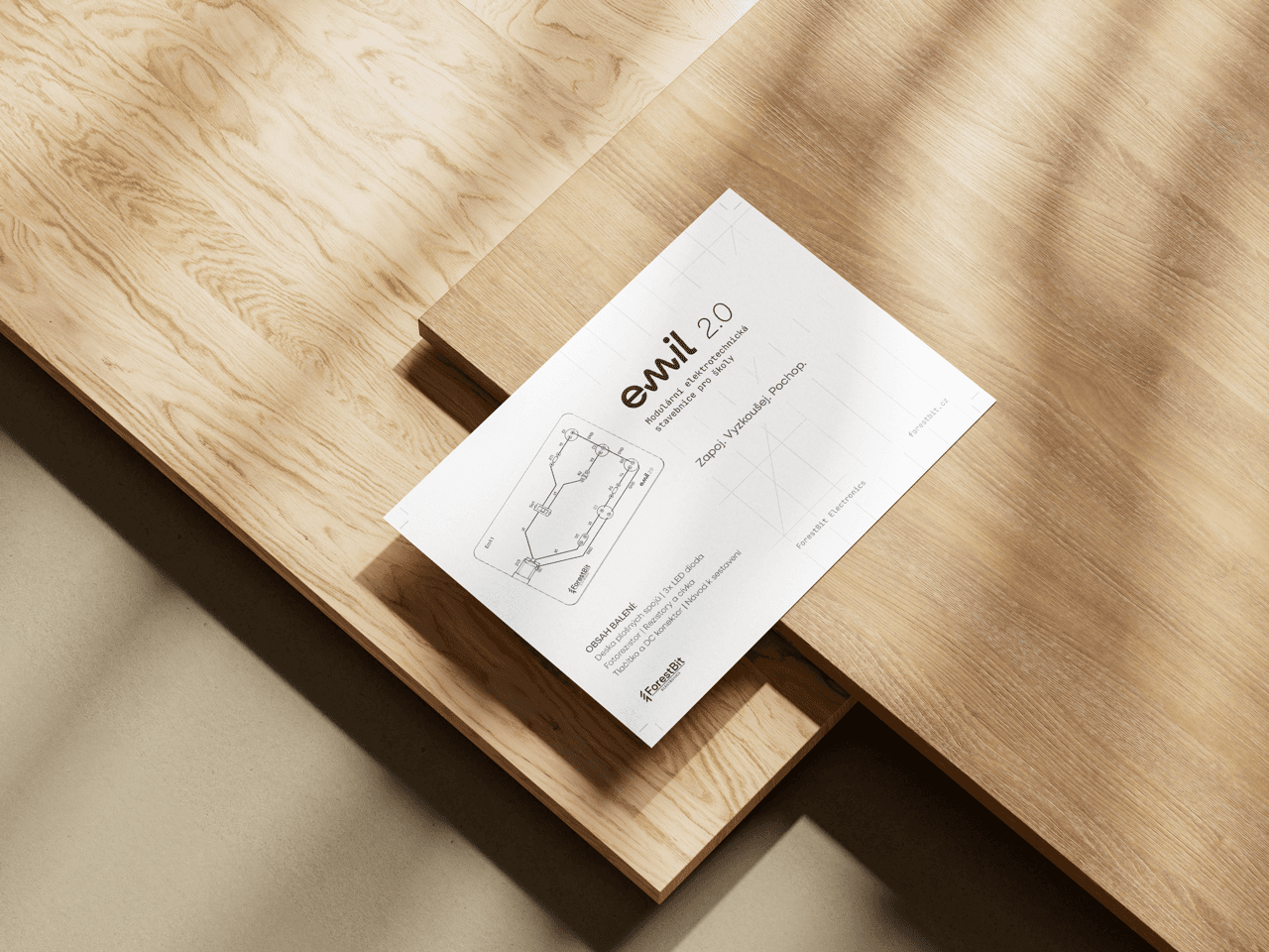
The result is a complete, clean, monochromatic identity:
Logotype and symbolism: A brand connecting the symbolism of electrical engineering with modern design.
Functional packaging: A box label that, thanks to the technical lines and CAD illustration, immediately communicates what's inside.
Ready for digital and print: A visual language ready for immediate deployment on an e-shop (UI elements prepared), social media, and printed guides for pupils.
High added value in a short time: In a few hours of work, the client went from a mere wish for a "label" to the complete foundations of a brand.
Market readiness: From an idea and a single circuit board, a mature product emerged, ready to be presented to schools and investors.
Cost savings for the future: When building a website or marketing, the client won't have to design from scratch — they got a ready-made visual manual.
What the project taught me: It confirmed that a designer's greatest value lies in truly understanding the brief. Had I delivered just a label, the client would have been figuring out how to build a website a month later. The conceptual approach saved both sides time and money, and the project nicely shows my ability to think in a broader context (a brand system) even on a seemingly small brief.

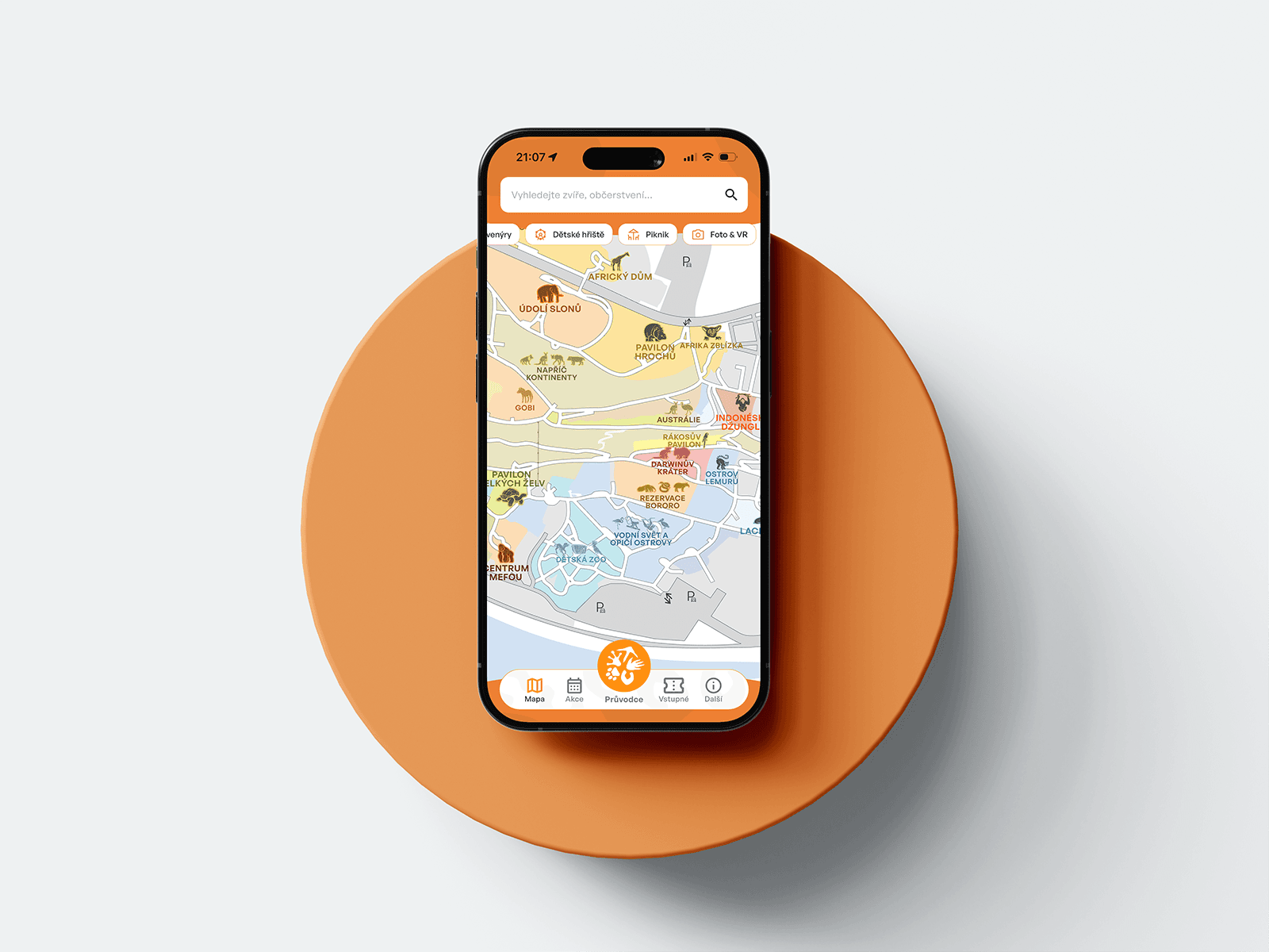
A mobile guide to Prague Zoo — interactive map, ticket sales, animated onboarding.

Gamifying Škoda Auto's corporate strategy as a 3D open-world game.

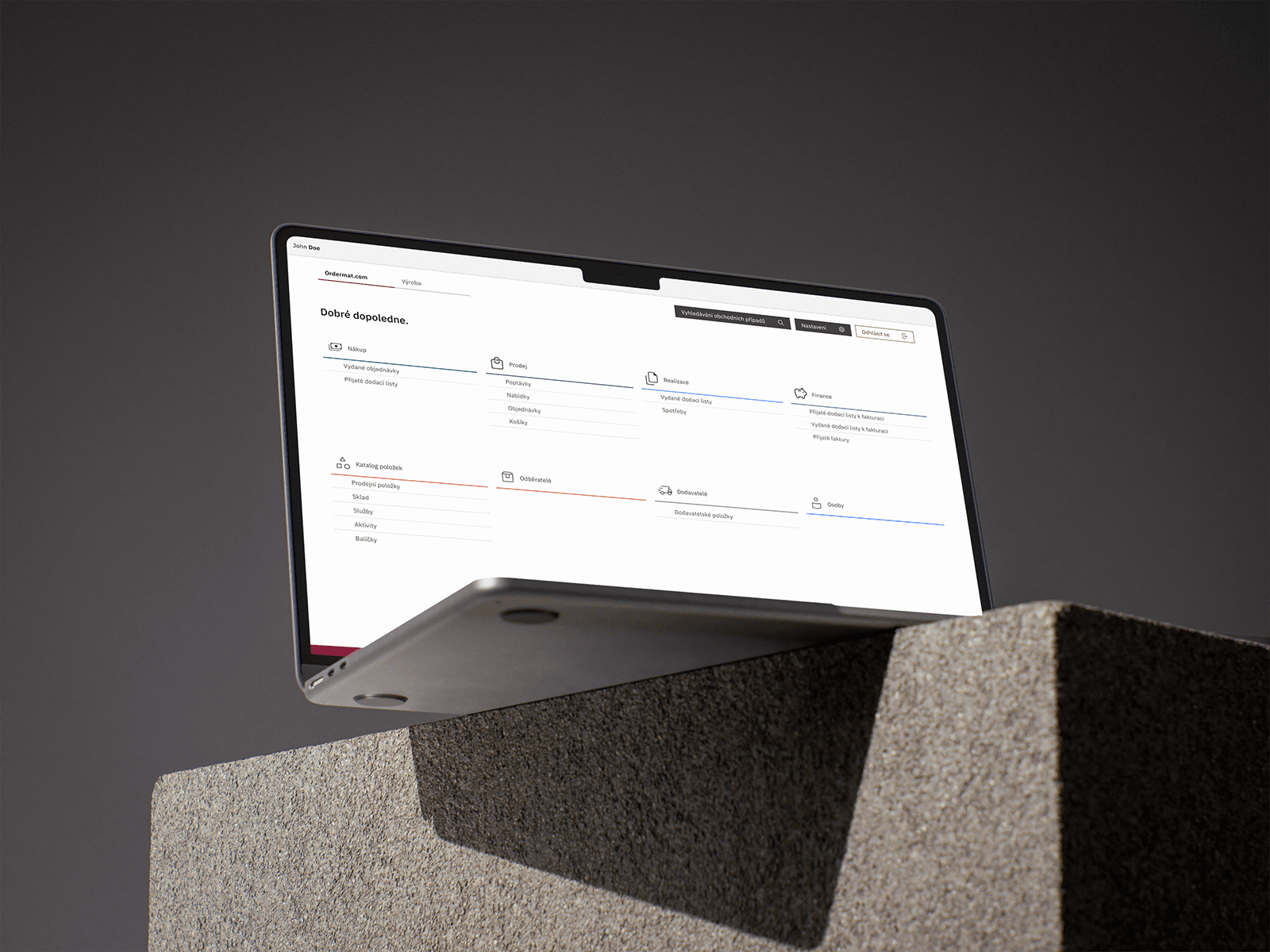
A robust company-management system with a connected B2B/B2C e-shop for catering.

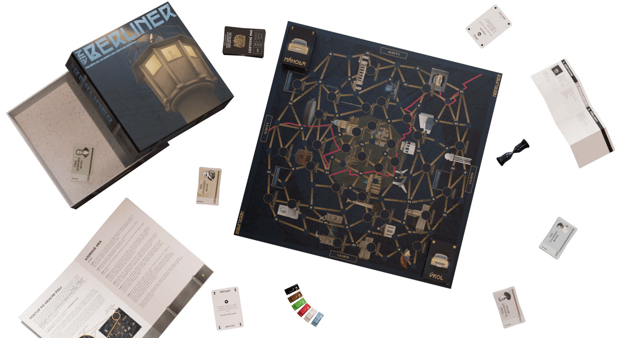
An original board game inspired by Papers, Please!, set in divided Berlin.

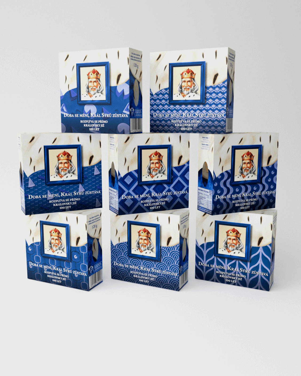
An anniversary packaging edition for an iconic cheese brand that won the competition and reached shelves across Czechia.

A concept mobile financial coach built on conversational AI, turning passive banking into proactive money management.

A complete visual identity and brand manual for a student tech community running hackathons and workshops.

A website redesign for a traditional garden centre — clear presentation of products, services, and live info, fully responsive.

Turning a technical prototype into a market-ready product — a cohesive visual identity built to scale to web.