Back to all works

DIKÉ Garden Centre Website

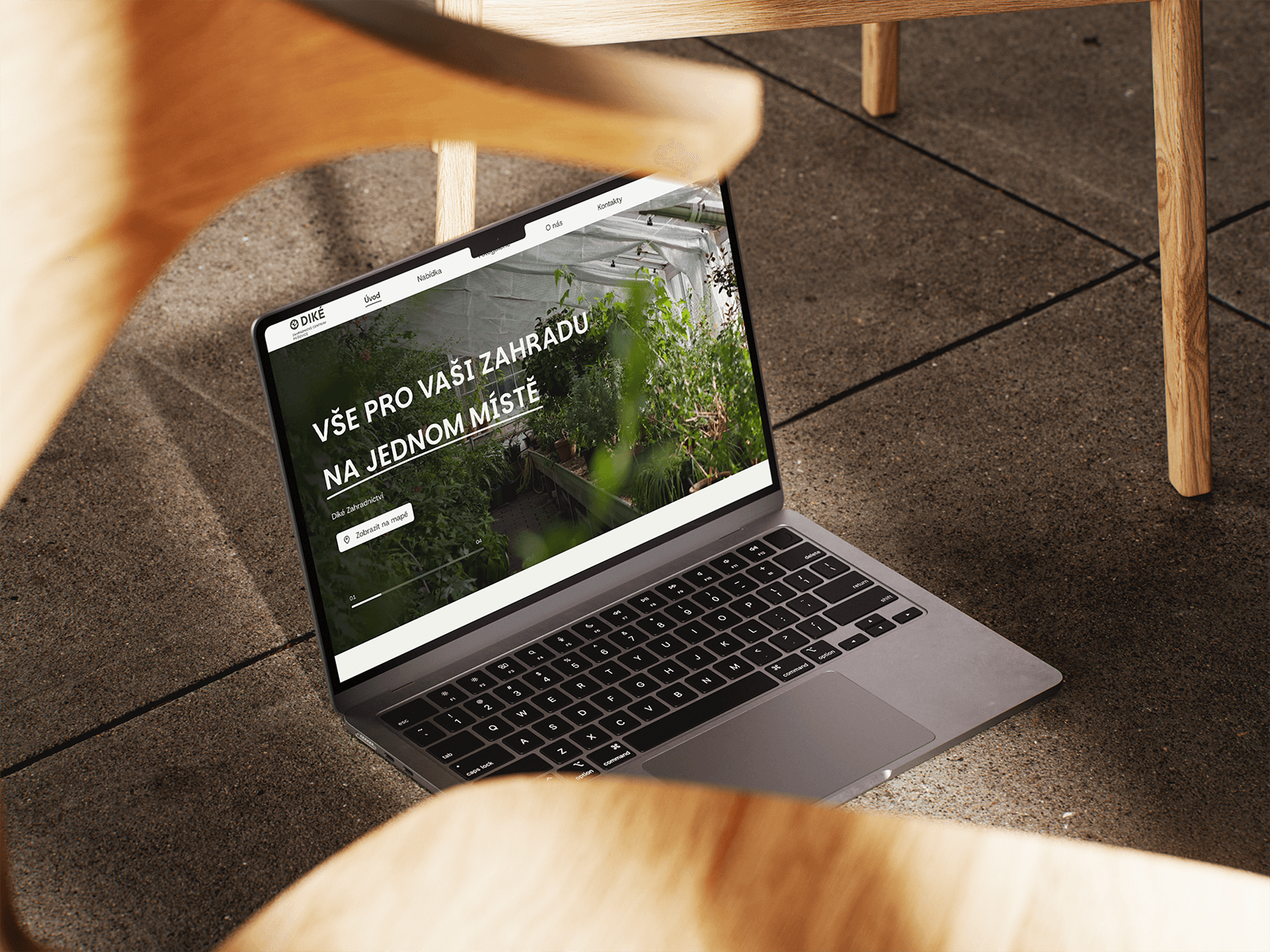
A complete redesign and development of a modern web interface for a traditional garden centre in Svijany, focused on easy navigation, mobile availability, and a clear presentation of products and services.

My role
UI/UX Designer
Team
2× UI/UX designer, 1× developer (with an external designer on the logo)
Year
2025
Tools
Figma
DIKÉ Garden Centre Website

About the project

The DIKÉ Garden Centre in Svijany is an established, large garden business with a rich offering of plants, garden landscaping, and complementary products. The client came to us needing a brand-new website built literally from the ground up.

Their original website was outdated, lacked any responsiveness for mobile devices, and visually failed to match the quality of the services offered. The client lacked a reliable channel for quickly sharing key information with customers — such as current opening hours, special offers, guides, or an overview of services. The project also included a full refresh of the visual identity in the form of a new logo, which we commissioned from an external designer.

Solved problem

Zero mobile optimization: The original site was almost unusable on smartphones, even though most customers look up opening hours or the address straight from the car or while planning a weekend shop on their phone.

Confusing structure and content: The wide range of products (ornamental and edible plants, substrates, gardening services) was confusingly structured.

Outdated visual impression: The look of the old site didn't reflect the vibrancy, beauty, and professionalism of the real garden centre.

My role

In a team of two UI/UX designers I was responsible for:

Designing the complete UI/UX: From wireframes to the final interface in Figma.

Responsive design: Detailed development of both the desktop and mobile versions, with an emphasis on comfortable use on touch screens.

Connecting with the new branding: Incorporating the new logo from the designer into the site's visual style and defining the colors and typography.

Collaboration with the developer: Preparing handoff materials for the developer and overseeing the fidelity of the implementation.

The process

We approached the design so as to simplify the user's path to information as much as possible:

Needs analysis and architecture: We defined the main customer journeys (I want to know where the garden centre is and when it's open; I want to know what they sell).

UI design and visuals: We chose a fresh, natural aesthetic that uses clean surfaces, quality photography, and enough contrast for great readability.

Mobile-first approach: We paid special attention to the mobile interface — we placed the key information (opening hours, directions, phone contact) so it's available with a single tap.

The solution

The result is a modern, fully responsive presentation of the DIKÉ Garden Centre:

A dominant hero section with live information: As soon as customers arrive, they clearly see the opening-hours status (whether it's open) and have easy access to directions to Svijany.

A clean catalogue of products and services: Services like garden landscaping or plant sales have their own clearly structured subpages with photo galleries for inspiration.

A unified visual identity: Incorporating the new logo gave the site a cohesive, professional, and modern look that represents the real experience of visiting the centre.

The result

A radical improvement in user experience: Customers orient themselves on the site instantly, on any device.

A dignified online presence: The DIKÉ Garden Centre gained a digital face that matches its size and the quality of its services in the Svijany region.

A smooth project handoff: Thanks to precise preparation in Figma, development went without complications and the site launched successfully on schedule.

What the project taught me: Working on a website for a local brick-and-mortar business showed me how crucial it is not to overcomplicate things. Garden-centre users don't need fancy effects — they need to find the right information, inspiration, and address within seconds. It also confirmed how much the quality of responsive-design preparation in Figma saves time during the actual coding.

Get in touch

All projects